Print / UV / Sublimation Effects Guide
Visual guide to the print effect settings. Once you select Print / UV / Sublimation, a second menu lets you choose the finish that matches your product and design.
How to Choose the Right Setting
After selecting Print / UV / Sublimation, a second drop-down appears. Work through it in this order:
- Start with your surface – Hard white goods use Sublimation, white products use UV on White, and natural wood uses one of the UV on Wood settings
- Does your design contain white? – On wood, only UV on Wood 3 and UV on Wood 4 keep white visible. Wood 1 and Wood 2 let those areas fall back to bare wood
- Match the coverage – Between Wood 1 and Wood 2, pick the level that suits your real print density and the lighting of your mockup template
Browse the examples below to find the setting that matches your product and design.
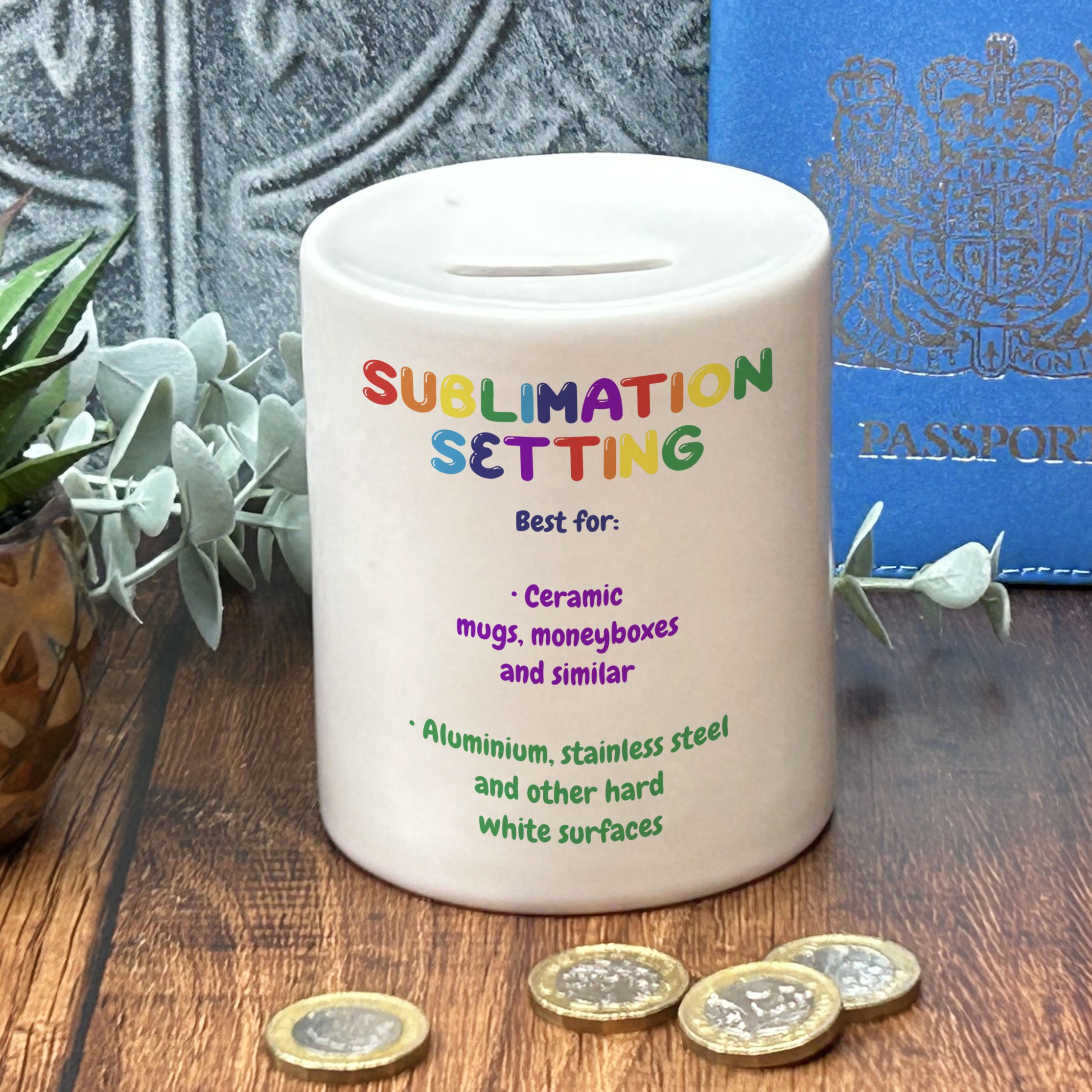
Sublimation
Best for:
- • Ceramic – mugs, moneyboxes and similar
- • White glass, stainless steel and other hard white surfaces
Visual result: A vibrant, full-colour print that sits flush with the surface. Any white in your design comes from the white substrate itself rather than printed ink.
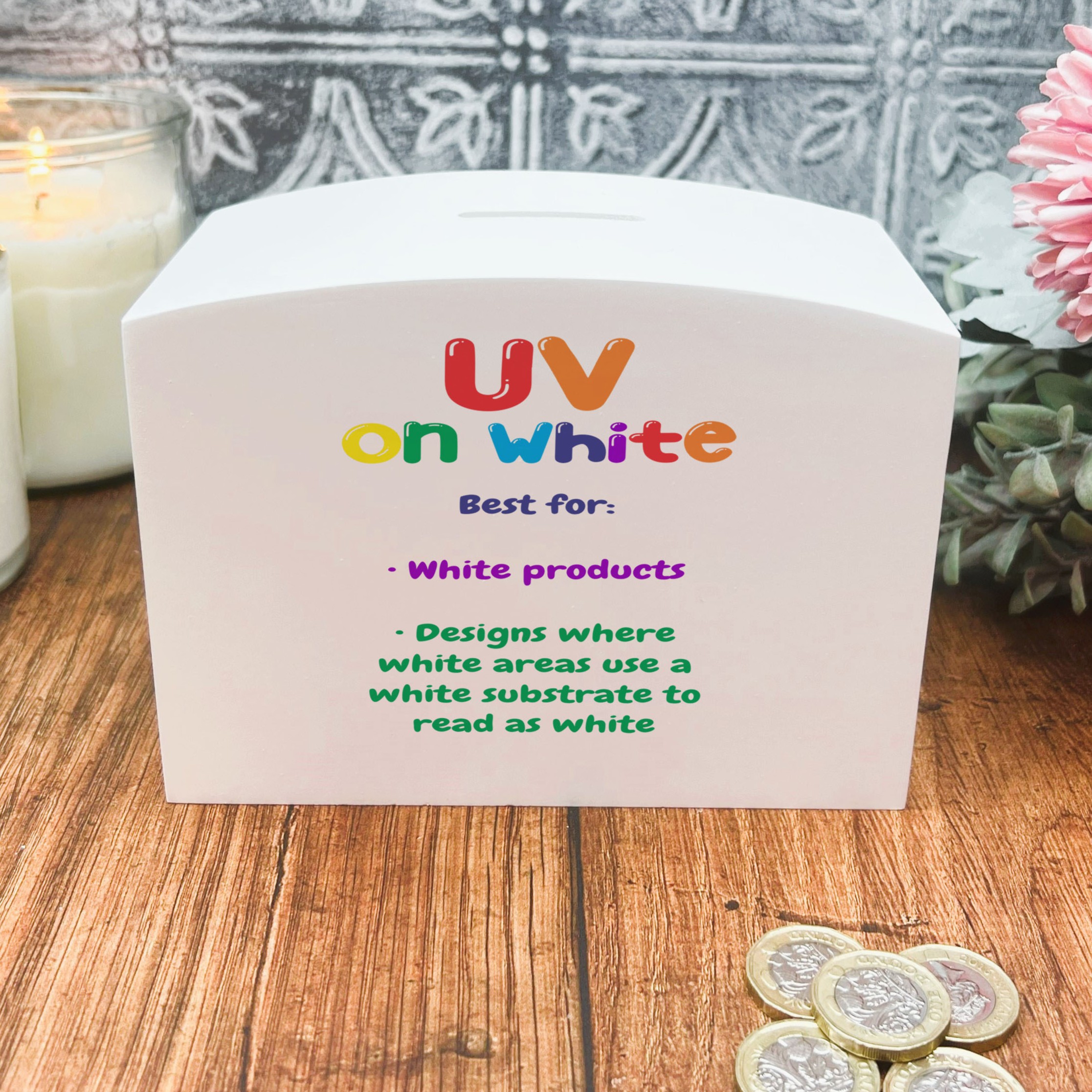
UV on White
Best for:
- • White products
- • Designs where white areas should read as white
Visual result: A UV print on a white surface. The white areas of your design are shown by the white substrate underneath rather than being printed, giving a clean, natural white.
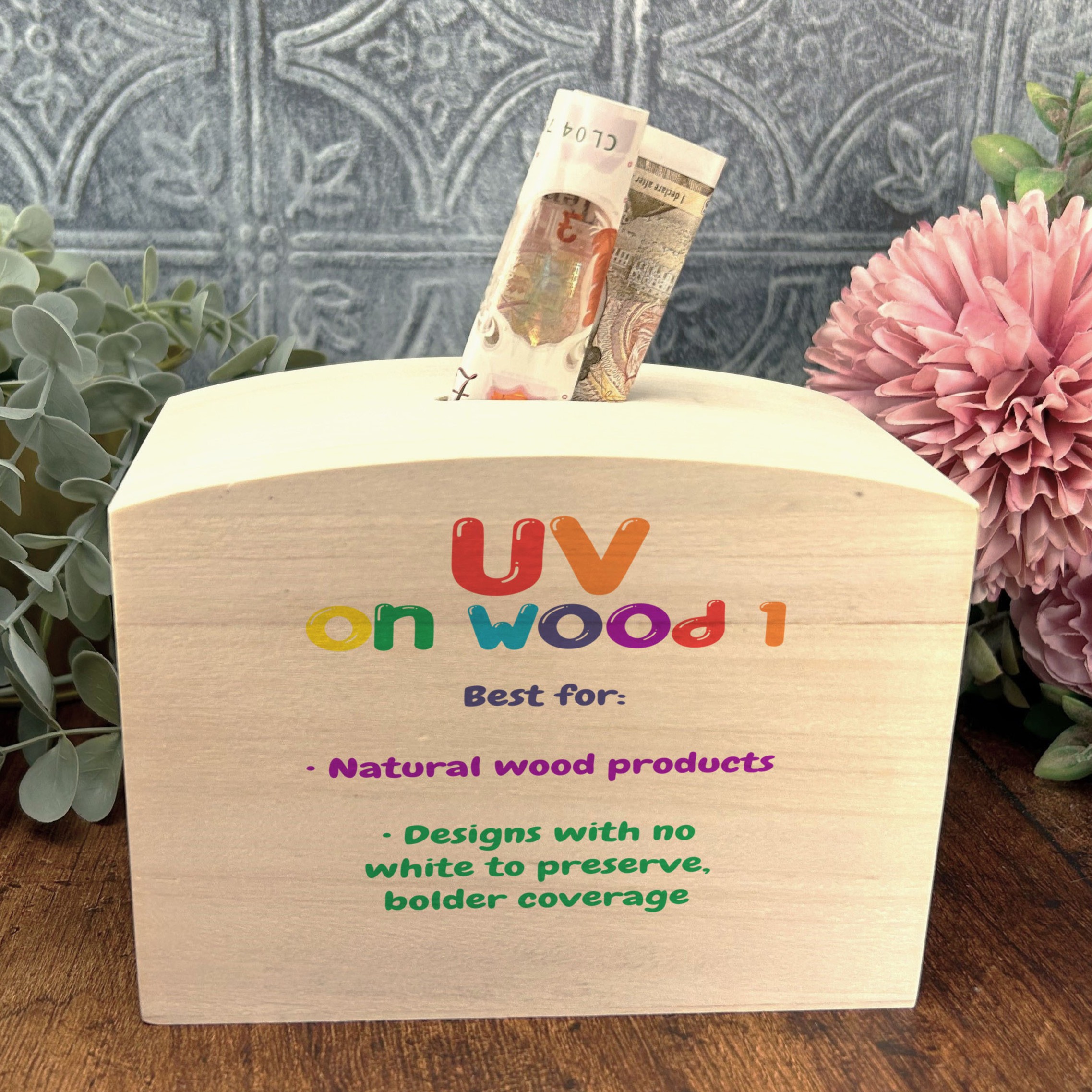
UV on Wood 1
Best for:
- • Natural wood products
- • Designs with no white to preserve, bolder coverage
Visual result: A UV print on natural wood with the grain showing through. The fuller of the two standard wood settings. White areas of the design are not printed – they show as bare wood.
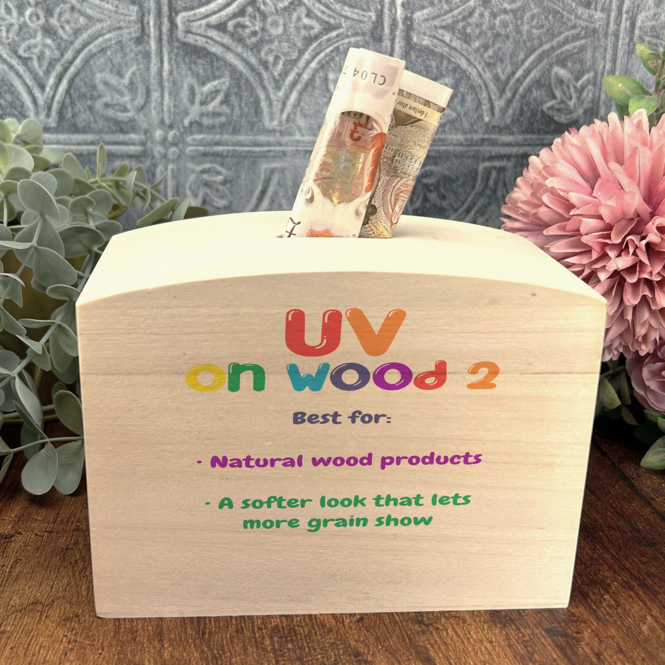
UV on Wood 2
Best for:
- • Natural wood products
- • A softer look that lets more grain show
Visual result: A lighter UV print on natural wood, letting more of the grain come through than Wood 1. As with Wood 1, white areas of the design are not printed and show as bare wood.
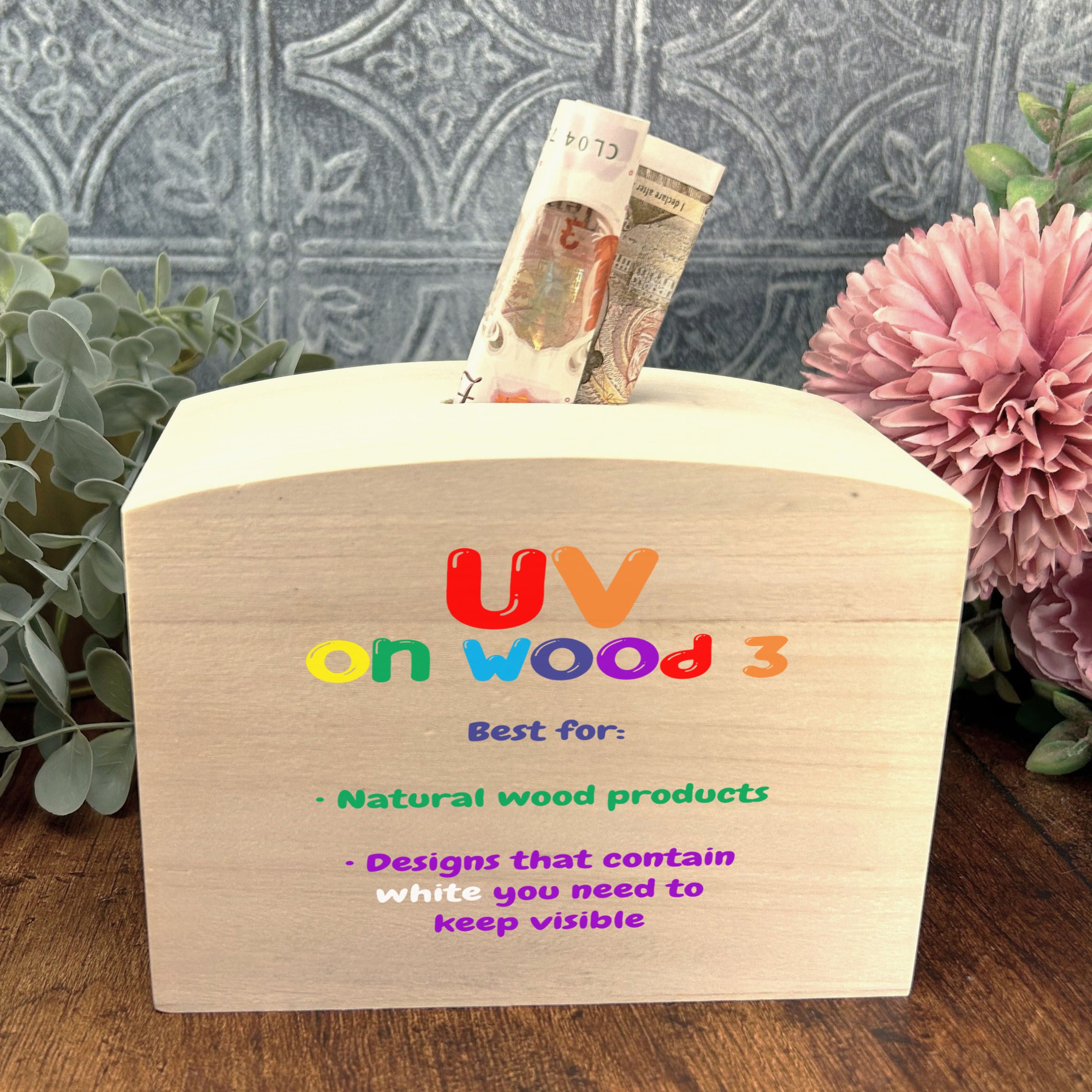
UV on Wood 3
Best for:
- • Natural wood products
- • Designs that contain white you need to keep visible
Visual result: Prints and preserves white in your design, so white detail stays visible against the wood instead of disappearing into the grain.
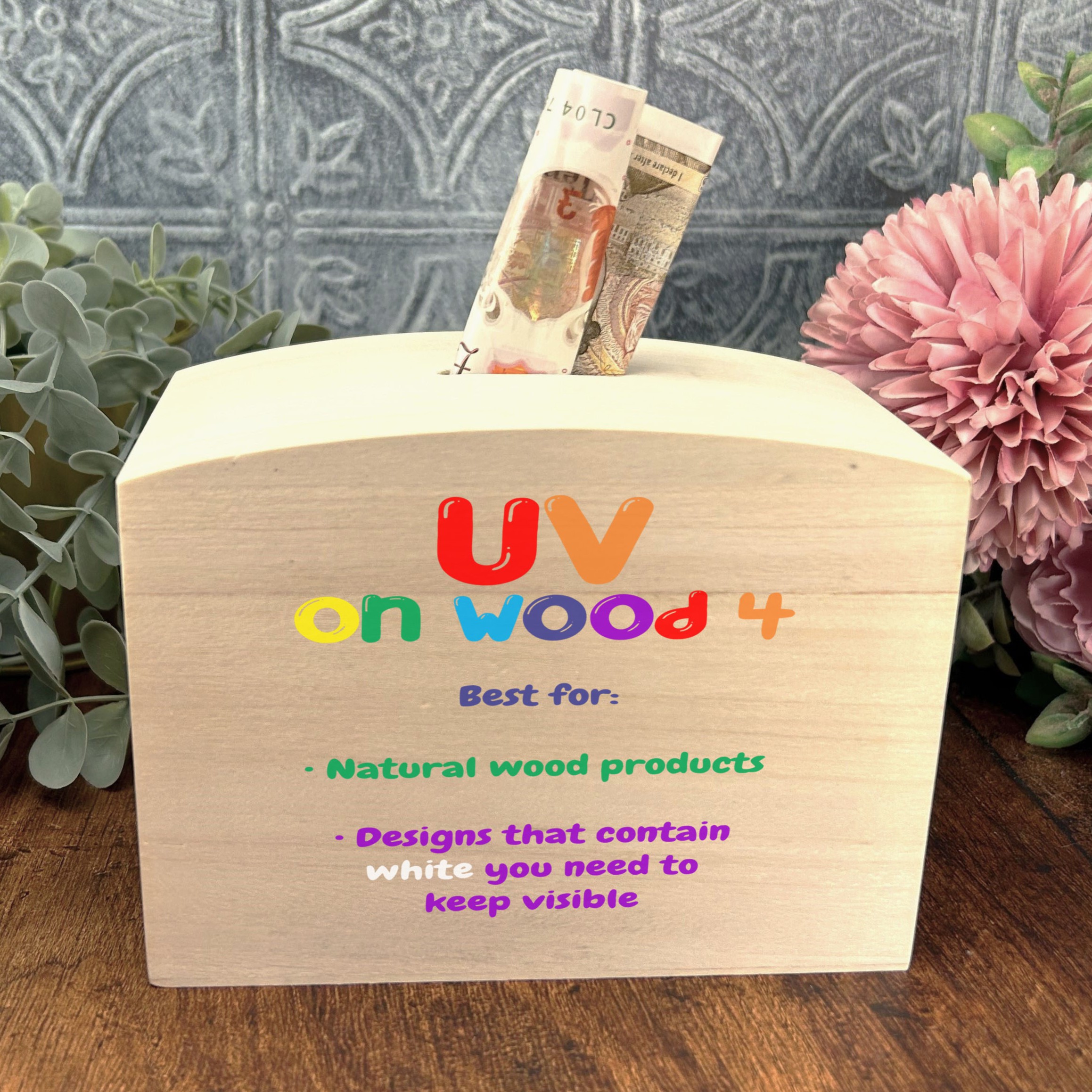
UV on Wood 4
Best for:
- • Natural wood products
- • Designs with white to keep, where you want bolder, more saturated colour
Visual result: Prints and preserves white in your design, like Wood 3, but with a bolder, more saturated colour finish. Choose this over Wood 3 when you want the colours to punch harder against the wood while still keeping white detail visible.
Quick Reference
| Setting | Name | Best For | White in design |
|---|---|---|---|
| 1 | Sublimation | Ceramic, white glass, stainless steel | From white substrate |
| 2 | UV on White | White products | From white substrate |
| 3 | UV on Wood 1 | Wood, bolder coverage | Shows as bare wood |
| 4 | UV on Wood 2 | Wood, more grain showing | Shows as bare wood |
| 5 | UV on Wood 3 | Wood designs with white detail | Printed and preserved |
| 6 | UV on Wood 4 | White detail with bolder colour | Printed and preserved |
Tips for Choosing the Right Setting
Match the surface first
Start with your product. Ceramic mugs, moneyboxes, white glass and stainless steel suit Sublimation. White products suit UV on White. Natural wood products use one of the four UV on Wood settings.
The white question on wood
This is the key decision for wood products. If your design contains white that needs to stay visible, use UV on Wood 3 or UV on Wood 4 – both print white, with Wood 4 giving a bolder, more saturated colour finish. With Wood 1 and Wood 2 those white areas fall back to bare wood, which can look great for grain-led designs but will lose any intentional white detail.
Wood 1 vs Wood 2
Both let the grain show through and neither prints white. Wood 1 gives fuller, bolder coverage; Wood 2 is lighter and lets more grain come through. Pick the one that matches how dense your real prints are and the lighting of your chosen mockup template.
Not sure where to start?
Run a small test batch across two or three settings to compare. Process just one or two mockups with each to see which matches your actual product and print style best.
Can't find the right setting? If none of the settings are quite getting the effect you need, email us at support@themockupfactory.com – we're happy to add any settings needed.
Looking for Engraving Effects?
If you're working with engraved products rather than printed ones, the wood engraving guide walks through all engrave settings with visual examples.